The browser you know, in your pocket: Maho on iOS and Android
Most desktop-first browsers break their promises the moment you leave your desk. You spend hours building a careful workspace of tabs, spaces, and split views on your computer. Then you unlock your phone on the train and open what claims to be the same browser. Instead of your working context, you get a generic homepage filled with clickbait headlines, an unfamiliar tab switcher, and a search bar disconnected from your work.
The industry has treated mobile browsers as cut-down companions for years. Companies assume that because a screen is smaller, your expectations should be lower. You get fewer controls, weaker typography, and cloud sync systems that stall out when you need them most.
We built Maho for people who care about their tools. When we started developing mobile versions for iOS and Android, we refused to make a stripped-down stranger. We wanted the browser in your pocket to feel like the browser on your laptop. It needed the same spatial organization, the same typography standards, the same consent-first agent runtime, and sync plumbing that delivers your context without requiring an account.
Both mobile apps are in active public beta today. They are not finished products, but they already carry the core DNA that makes Maho feel like Maho.
The mobile gap in the 2026 browser field
Section titled “The mobile gap in the 2026 browser field”To understand why mobile browsing feels fragmented today, look at where recent desktop innovators landed on phones.
The Browser Company deserves real credit for trying new ideas with Arc. They understood that mobile navigation needed fresh thinking. When they built Arc Search for iOS, they introduced Browse for Me, an ambitious feature that synthesized search results into clean summary cards. The animations were slick, and the interface felt playful.
Yet Arc Search quickly became a separate product with its own distinct personality rather than a mobile version of Arc desktop. The desktop spaces and vertical tabs did not translate directly into the mobile experience. Android users were left out entirely, because an Android version never materialized. When the company shifted its primary attention toward Dia, the momentum behind bridging the desktop-to-mobile bridge faded.
Zen Browser took a different route. As a Firefox-based community favorite, Zen won over many power users with gorgeous desktop customization, compact vertical sidebars, and tidy workspaces. Zen focused its engineering energy squarely on the desktop environment. Building a modern mobile browser from scratch is an immense technical lift, so Zen has remained desktop-only.
That leaves a familiar void for anyone who works across multiple devices every day. You either use platform defaults like mobile Safari and Chrome, which push promotional clutter into your new tab page, or you bounce between companion apps that forget where you left off.
One browser, both pockets
Section titled “One browser, both pockets”Maho’s mobile apps run on native platform engines. On iOS, we build on top of Apple’s WKWebView framework, while our Android shell uses the modern Android System WebView. Relying on native system webviews gives us immediate platform stability, battery efficiency, and standard touch handling. This lets us focus our engineering on the layer that matters most: the interface and the local runtime.
Both apps are in public beta right now. We say that directly because beta means you will encounter rough spots. Gesture animations are still getting tuned, and edge-case layouts on folding screens need polish.
What you will not find is a dumbed-down experience. The mobile interface adapts desktop Spaces for one-handed thumb reach. A bottom toolbar gives you immediate access to your named spaces. Swiping horizontally across the bottom bar switches your active space immediately.
Every tab you open stays inside its assigned space. You do not have to dig through an unsorted pile of eighty tabs to find the research paper you opened twenty minutes ago. Unpinned tabs remain visible in their space drawer until you close them. We do not hide active tabs behind opaque archive shelves, and we never inject third-party news widgets or trending stories into your new tab screen. The screen opens blank and ready for your next thought.
Sync that actually arrives
Section titled “Sync that actually arrives”A mobile browser is only as useful as its connection to your main workstation. If sending a tab from your laptop to your phone requires clicking through three submenus or waiting five minutes for a cloud database to poll, you will stop using it.
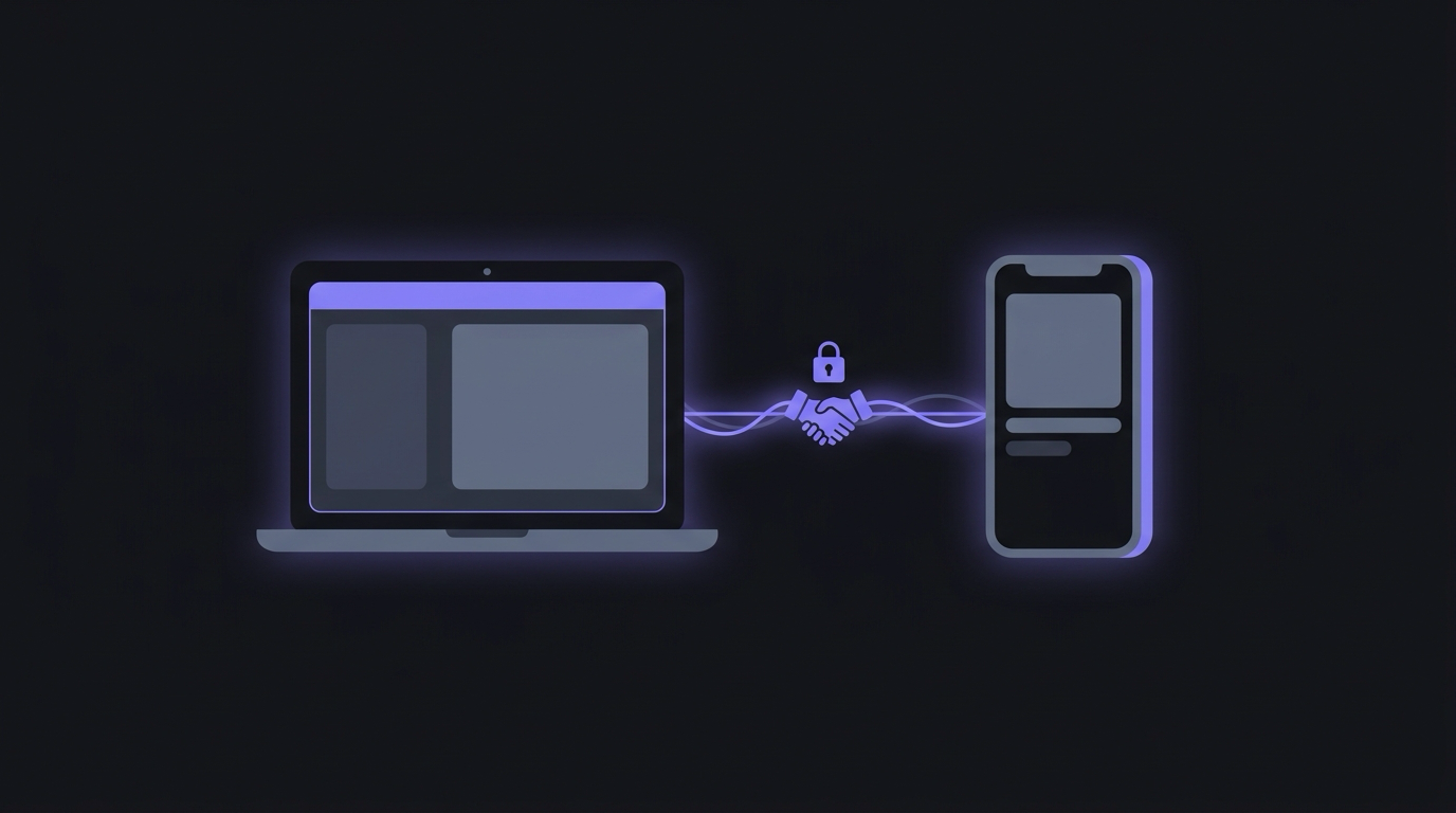
Maho uses an end-to-end encrypted relay architecture. Pairing your phone with your desktop takes ten seconds. You open Maho on your desktop, bring up the pairing QR code, and scan it with your phone camera.
Behind that single scan, both devices run an X25519 elliptic-curve Diffie-Hellman key exchange. They negotiate a shared secret directly, show a matching six-digit verification code on both screens for confirmation, and derive long-term encryption keys. The relay server sitting between them only handles encrypted blobs. It cannot inspect your URLs, read your space names, or see your tab history.
Because the relay acts as a lightweight message pipe, sync events arrive almost instantly when both devices are active. When you find an article on your desktop right before walking out the door, you send it to your mobile space with a single hotkey. By the time you pull your phone out of your pocket, the tab is already waiting in that space.
Sync works both ways without friction. If you bookmark a reference or add a tab to your project space while riding the train, that change is sitting on your desktop when you return. You never have to create an account, remember a password, or trust our servers with your browsing records just to keep your devices aligned.
Reader mode with real typography
Section titled “Reader mode with real typography”Reading on a smartphone is often a frustrating experience. Web pages are weighed down by sticky headers, modal newsletter overlays, floating video players, and cookie consent banners that occupy half the screen.
Most built-in mobile reader modes treat text cleanup as an afterthought. They strip away the ads, but they dump the text into a rigid layout with harsh pure-black backgrounds and clumsy font scaling.
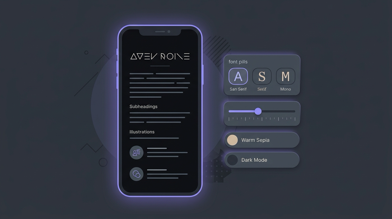
Maho treats Reader Mode as a primary reading surface. When you tap the reader icon on any article, the page transforms into a calm, focused reading environment with real typographic controls.
You get a dedicated typography sheet right from the bottom bar. Instead of settling for a single system font, you can choose between carefully tuned serif, sans-serif, and monospace typefaces. A granular size slider lets you dial in the exact scale your eyes prefer.
Themes go beyond a binary light and dark switch. You can switch between crisp paper white, a warm sepia tone calibrated for daylight, and a deep charcoal dark mode that avoids the blinding contrast of pure black. Line heights, paragraph margins, and column widths adjust dynamically based on your chosen font size to maintain comfortable line lengths. Reading a long essay on your phone should feel closer to holding a well-printed book than deciphering a messy web page.
The AI you approved on desktop is the AI you meet on mobile
Section titled “The AI you approved on desktop is the AI you meet on mobile”Many mobile apps introduce AI as an aggressive, uninvited assistant that tries to summarize every page automatically or guess what you want to buy next. That approach turns the browser into a noisy billboard.
Maho brings the exact same consent-first agent runtime to mobile that runs on the desktop. We share the underlying web-ai bundle across both platforms. The rules that protect your attention on your computer protect your attention on your phone.
The assistant stays silent until you explicitly invoke it. When you open the assistant panel on a page, it does not scan your clipboard or send the DOM to a third-party server in the background. It reads the active page only after you request an analysis, translation, or extraction.
All permission gates remain intact. If an agent workflow attempts to perform an action that modifies data or triggers an external call, the mobile app shows the same typed approval prompt you see on desktop. The prompt shows the exact operation, the target parameter, and the explicit reason code if an action gets denied. You never have to worry that the mobile app will make assumptions or take actions you never approved.
What beta means here
Section titled “What beta means here”We want to be straightforward about where Maho on iOS and Android stands today. These mobile apps are in active public beta, and we are updating them weekly.
You will encounter rough edges. Background sync on iOS can occasionally experience brief delays when the operating system aggressively freezes background tasks during low-power mode. Certain web applications that rely on custom multi-touch gesture handlers might require minor tuning in our gesture recognizer stack. We are actively working through these specific platform quirks.
We chose to put these builds in your hands now because real-world feedback from people who browse daily makes the product better. The foundation is solid: private encrypted sync, spatial tab organization that respects your context, reading tools built with real craft, and an assistant that honors your explicit consent.
If you are tired of mobile browsers that feel like strangers to your desktop workspace, grab the beta build on iOS or Android. Pair it with your desktop in a few seconds, take your spaces with you, and tell us what you think.