
Split view in two drags: side-by-side browsing without window clutter
Multitasking on a desktop computer usually decays into window chaos. You open a document in one window, drag an analytics dashboard into another, and then spend five minutes aligning their edges on your screen. When you switch applications, macOS buries one half of your workspace. Resizing one side leaves the other window untouched, creating an awkward gap across your desktop.
Operating system window managers try to fix this with tiling shortcuts and snap zones. Even with third-party window managers, running two independent browser instances brings penalties. You double your tab strips, duplicate extension icons, clutter your dock, and lose track of which window owns which session.
Side-by-side browsing should not require two application windows. It belongs inside the browser itself, organized within your active workspace, and controlled through natural gestures.
Why split view matters
Section titled “Why split view matters”Real work rarely happens in a single tab. Most knowledge work, software development, and research involves comparing two sources or feeding data from one page into another.
Consider three common workday situations where split view transforms your speed:
First, reference documentation beside an interactive dashboard. You might read a Stripe payment API guide on the left while testing webhook payloads inside a staging dashboard on the right. Switching tabs back and forth disrupts your short-term memory. Splitting the view lets your eyes dart across the boundary while your hands stay on the keyboard.
Second, pull request code reviews beside live preview environments. Reviewing a complex pull request on GitHub requires checking code diffs against the running build. With split view, you inspect the changed React component in one pane while clicking through the preview deploy in the other. You spot visual regressions immediately without cycling through browser history.
Third, video lectures or technical talks beside a note-taking canvas. When watching a recorded keynote or conference tutorial, you need to pause, rewind, and summarize key points in a markdown editor or Linear ticket. If the video lives in a hidden background window, every pause requires an alt-tab detour. Placing the video directly beside your scratchpad keeps your focus intact.
Window clutter happens when you create entire browser windows for quick comparison tasks. Split view solves this problem by keeping both views inside a single tab container.
How Arc and Zen do it today
Section titled “How Arc and Zen do it today”Browsers have experimented with split views for years. Arc and Zen Browser deserve real credit for pushing the concept into the modern conversation.
Arc showed the industry that split view belongs in the primary browser window rather than behind obscure developer flags. The Browser Company made side-by-side tabs feel stylish. Arc lets users combine up to four tabs in a grid, which proved that power users crave horizontal layouts.
Yet Arc’s approach carries friction. Splitting tabs in Arc often feels like an intentional configuration step rather than an immediate physical action. You right-click a tab, navigate submenus, or memorize key combinations like Command-Option-Plus. Dragging tabs inside Arc’s sidebar can feel ambiguous. Sometimes a drag reorders your list, while other times it snaps into a split pane you did not intend to create.
Zen Browser brought vertical tabs and split view to Gecko users. Its interface offers flexible multi-pane layouts with customizable grid ratios. The team behind Zen built an impressive interface that lets users group tabs into custom split containers.
The limitation in Zen comes from the ceremony required to set up and modify those layouts. Building a three-pane or four-pane view in Zen frequently requires interacting with context menus or grid selection popups. When you want to rearrange your split layout on the fly, the direct manipulation does not always respond the way your hands expect.
Both browsers proved that split view is essential. The missing piece is predictable physical interaction. You should not have to think about layout algorithms before placing two pages side by side.
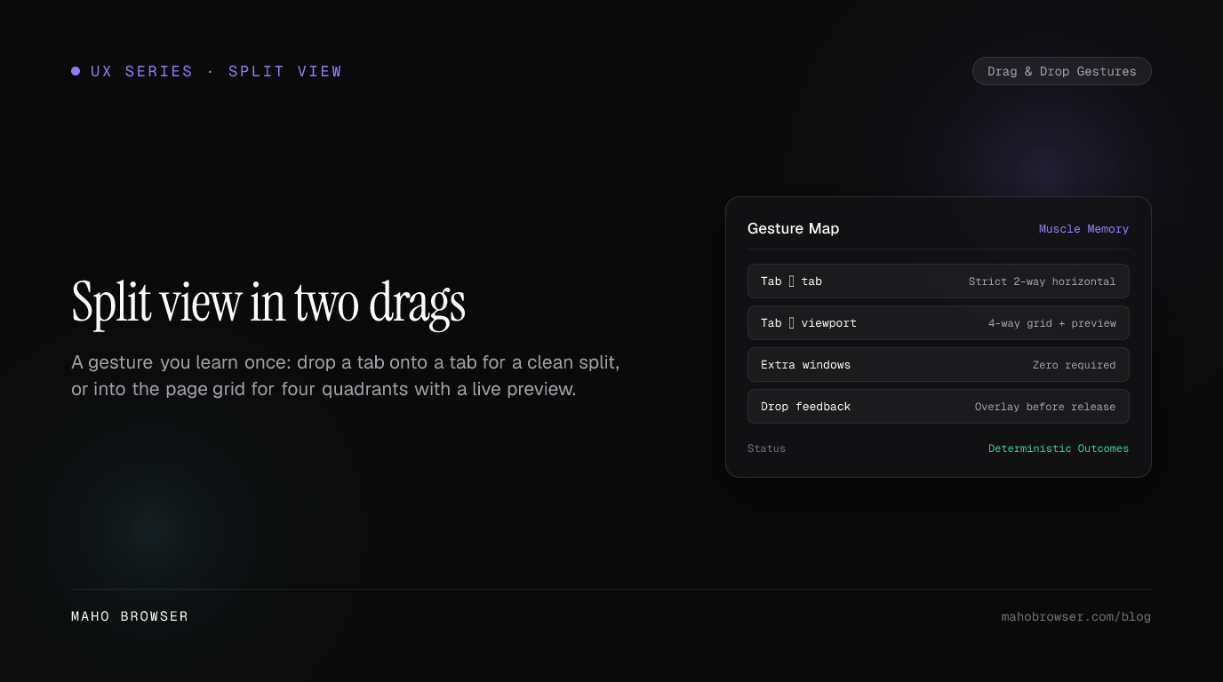
Two gestures, two outcomes: tab-onto-tab means strict 2-way horizontal split, every time
Section titled “Two gestures, two outcomes: tab-onto-tab means strict 2-way horizontal split, every time”Maho replaces layout menus with two unambiguous drag gestures. The first gesture is built for the most common split scenario: placing two tabs side by side.
When you drag one tab directly onto another tab in Maho’s sidebar, the result is always a strict 50/50 horizontal split.
Sidebar Action: Drag Tab A onto Tab BResult:+-------------------+-------------------+| | || Tab A | Tab B || (50%) | (50%) || | |+-------------------+-------------------+Predictability is the design principle here. In many browsers, dropping an item near an edge produces uncertain outcomes. You wonder whether the drop will nest the tab, create a tab group, or build a vertical stack. Maho eliminates that guesswork. Sidebar tab-onto-tab always means a two-way horizontal split.
+-------------------------------------------------------------+| Maho Sidebar: [Docs Tab] dragged onto [Dashboard Tab] || Outcome: Single split container created instantly |+-------------------------------------------------------------+Breaking the split is just as straightforward. Grab either tab handle in the sidebar and pull it away into the open list. The split dissolves instantly, and the remaining tab expands smoothly to fill the entire viewport without reloading the page or dropping your scroll position.
By giving tab-onto-tab a single fixed meaning, Maho turns side-by-side browsing into pure muscle memory. You never pause to wonder what layout will appear.
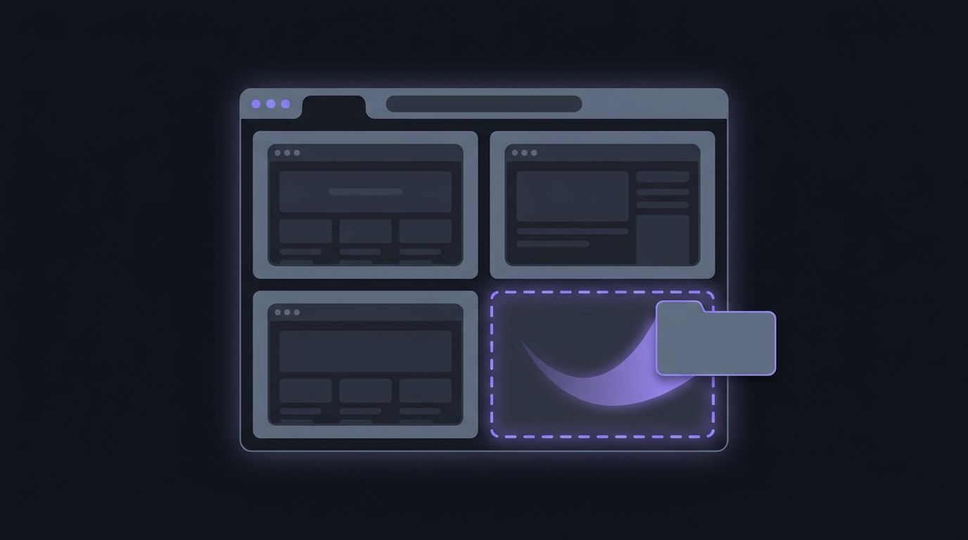
Four quadrants on demand: viewport drag with live drop-target preview before release
Section titled “Four quadrants on demand: viewport drag with live drop-target preview before release”Sometimes two side-by-side panes are not enough. Complex operations, such as monitoring server metrics while reading logs and chatting in a web client, require a multi-pane grid.
Maho handles advanced layouts through its second gesture: dragging directly into the viewport.
When you grab any tab from your sidebar and drag it over the active web page, Maho enters spatial layout mode. As your cursor glides across the screen, the browser illuminates a translucent drop preview over the target zone.
Viewport Drop Zones:+---------------------+---------------------+| | || Top Left | Top Right || Drop Target | Drop Target || | |+---------------------+---------------------+| | || Bottom Left | Bottom Right || Drop Target | Drop Target || | |+---------------------+---------------------+Hover near the left third, and the left vertical half lights up. Move toward the upper-right corner, and a crisp quadrant highlights before you release the mouse button.
This visual feedback removes all anxiety from complex window arrangements:
- You see the exact layout geometry before committing the drop.
- You can position up to four distinct pages in custom grid configurations.
- If you change your mind mid-drag, moving your cursor back to the center or pressing the Escape key cancels the action without modifying your workspace.
Dragging into the viewport gives you complete spatial freedom without cluttering the interface with modal configuration panels.
Divider discipline (adjusting ratios, keyboard flow, zero extra windows)
Section titled “Divider discipline (adjusting ratios, keyboard flow, zero extra windows)”Creating a split view takes half a second. Living in that split view throughout your workday requires precise divider controls and seamless keyboard navigation.
Maho treats split dividers as interactive precision tools:
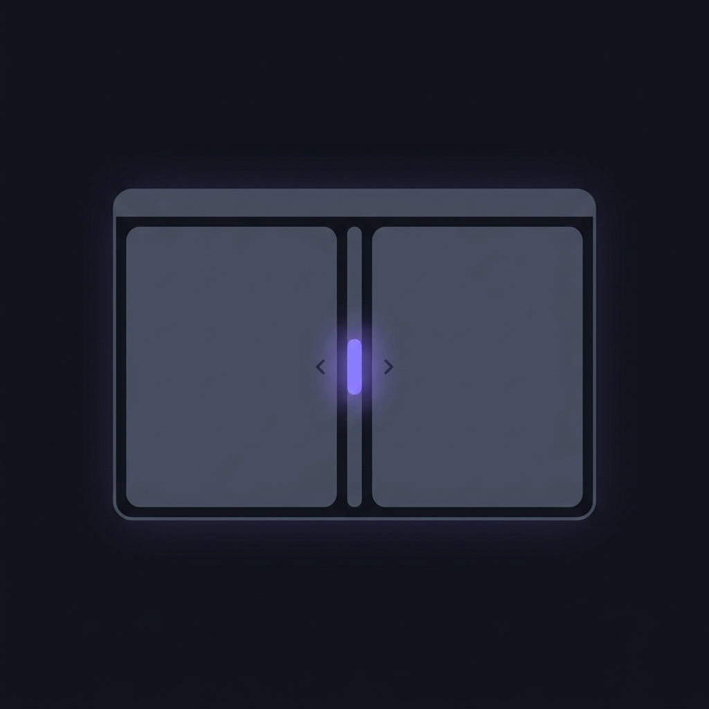
- Smooth ratio adjustments. Grab the hairline divider between any two panes and drag to rebalance screen real estate. If you are writing an essay with a slim outline pane on the left, slide the divider to a 75/25 ratio.
- Instant double-click centering. Double-clicking any divider line snaps the adjacent panes back to an equal 50/50 balance.
- Persistent pane state. When you resize your main browser window, Maho preserves your proportional pane ratios rather than collapsing small panes into unreadable slivers.
Keyboard flow receives the same level of attention. You do not need to reach for your trackpad to switch between active split panes. Pressing Option-Left Bracket or Option-Right Bracket moves keyboard and scrolling focus across panes instantly.
Closing tabs within a split view behaves predictably. When you press Command-W, Maho closes only the currently focused pane. The neighboring pane stretches out to fill the vacant area smoothly. You never end up with blank canvas regions or orphaned frame borders.
Most importantly, every split view lives cleanly inside your current Space. Your operating system sees exactly one high-performance window, keeping your application switcher and Mission Control clean.
Building the reflex: a one-week habit experiment
Section titled “Building the reflex: a one-week habit experiment”Adopting split view requires unlearning years of bad operating system window habits. If you want to make side-by-side browsing a reflex, try this seven-day routine:
On days one and two, eliminate duplicate browser windows. Whenever you feel the urge to tear off a tab to place it beside your current work, stop. Drag that tab onto your primary tab in the sidebar instead. Notice how quickly you can scan both pages without managing overlapping window edges.
On days three and four, experiment with viewport drop previews. When reviewing pull requests or comparing staging environments, drag your secondary tab directly into the right half of your viewport. Pay attention to the live highlight before you release the mouse.
On days five through seven, integrate keyboard pane navigation. Use Option-Left Bracket and Option-Right Bracket to jump between panes while typing. Double-click dividers to reset ratios when your research task concludes.
By the end of the week, window-tiling utilities feel unnecessary for web tasks. Side-by-side browsing becomes a fluid, natural extension of how you think and work.